
As a web designer, I’m always on the lookout for ways to create visually appealing and user-friendly interfaces. Material Design, developed by Google, provides a cohesive design language and a vast set of UI components, making it a popular choice for Angular developers. In this article, I’ll guide you through the basics of implementing Material Design in your Angular app and offer styling tips for your first component.
Why Material Design?
Material Design offers:
- Consistency across your app
- A wide variety of ready-made UI components
- Responsiveness and accessibility
Setting up Angular Material
To start using Material Design in Angular, follow these steps:
- Install Angular Material
ng add @angular/material
-
Choose a Prebuilt Theme
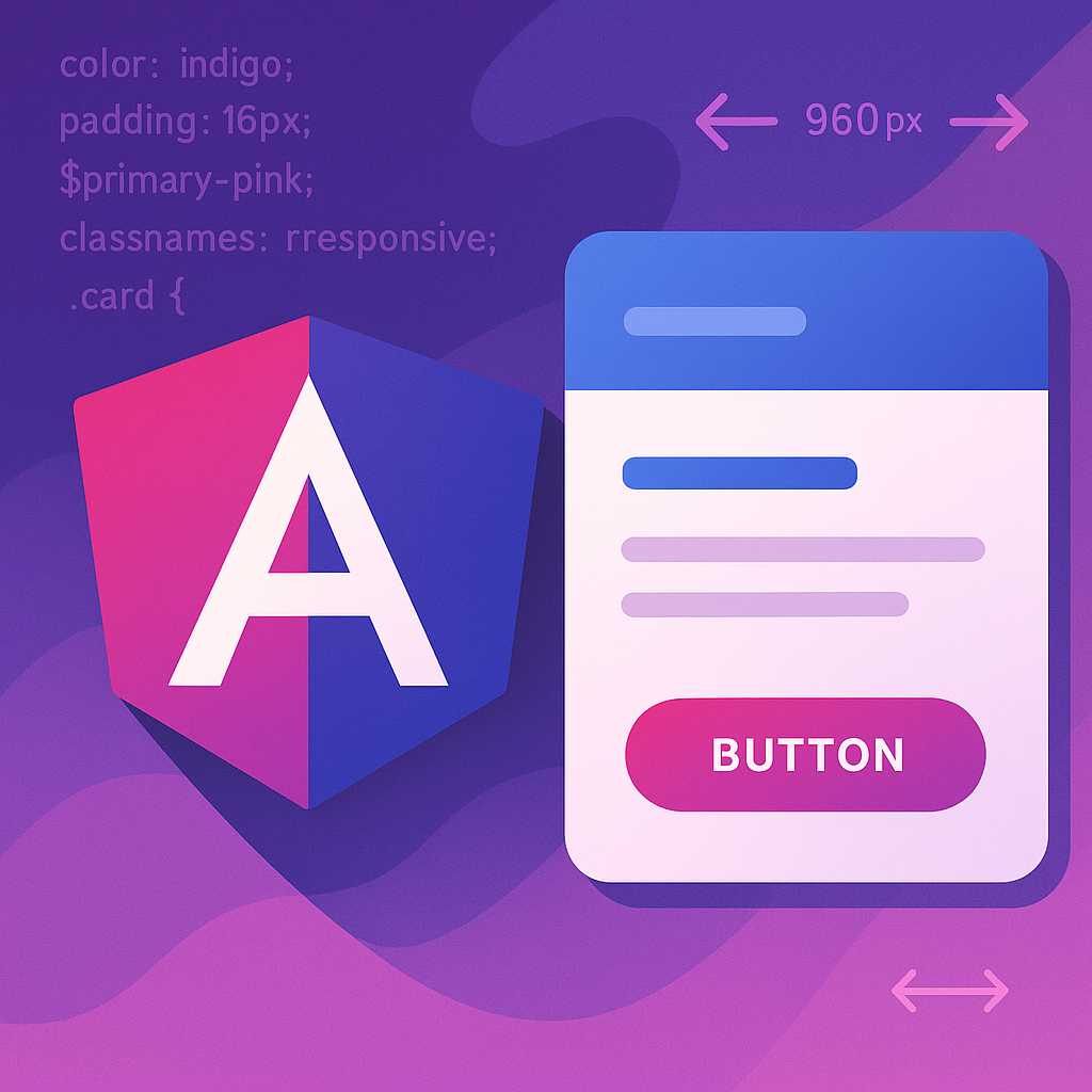
During installation, you’ll be prompted to select a prebuilt theme. For beginners, I recommend starting withIndigo/Pinkfor its balanced contrast. -
Import Material Modules
Open yourapp.module.tsand import the necessary Material modules. For instance, to use buttons and cards:
import { MatButtonModule } from '@angular/material/button';
import { MatCardModule } from '@angular/material/card';

@NgModule({
  imports: [
    MatButtonModule,
    MatCardModule,
    // other modules
  ]
})
Styling Your First Material Component
Let’s create a simple, eye-catching card component.
- Update your template:
<mat-card class="custom-card">
  <mat-card-title>Welcome to Material Design</mat-card-title>
  <mat-card-content>
    <p>This is your first styled Material component!</p>
  </mat-card-content>
  <button mat-raised-button color="primary">Get Started</button>
</mat-card>
- Add custom SCSS styling:
.custom-card {
  max-width: 400px;
  margin: 2rem auto;
  padding: 1rem;
  background: linear-gradient(135deg, #ece9f7 0%, #e1f5fe 100%);
  box-shadow: 0 4px 20px rgba(0,0,0,0.1);
  border-radius: 16px;

  mat-card-title {
    color: #3f51b5;
    font-weight: 700;
  }
}
Pro Tip: Responsive Typography
Material Design components scale beautifully, but you can further enhance responsiveness by using Angular Material’s typography config. Check the documentation to set up custom breakpoints and typography styles.
Conclusion
With Angular and Material Design, it’s easy to build stunning interfaces efficiently. Experiment with different components and SCSS customizations to match your brand and UX goals. Have fun designing, and stay tuned for more tips!
— Maddie
Leave a Reply