
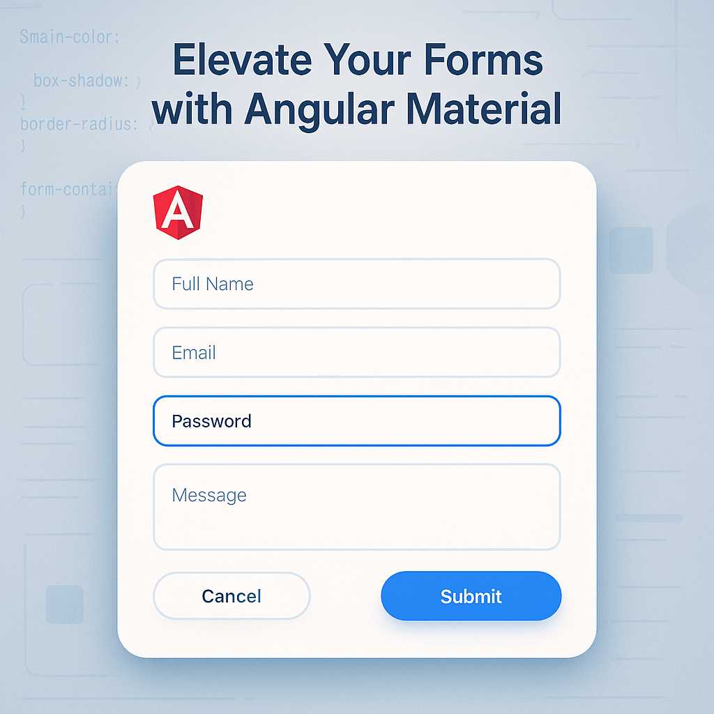
When creating modern web applications, forms play a vital role in gathering user input. But a form is more than a collection of fields—it’s an opportunity to provide clarity, branding, and a seamless user experience. Angular Material makes it easy to craft beautiful, responsive, and accessible input forms. In this guide, I’ll walk you through the essentials of elevating your Angular forms using Material Design components and custom SCSS styling.
Why Choose Angular Material for Forms?
Material Design brings consistency, delightful animation, and a vast component library. With Angular Material, you can quickly implement:
- Input fields with floating labels and error messages
- Form field layouts that adapt responsively
- Rich form controls like selects, date pickers, and autocompletes
- Built-in accessibility features
Setting Up Your Angular Project with Material
First, ensure you have Angular CLI installed. If not, run:
npm install -g @angular/cli
Create your project:
ng new material-form-demo
cd material-form-demo
Add Angular Material:
ng add @angular/material
Pick a Material theme, choose typography, and set up animations when prompted.
Building Your First Material Form
Let’s scaffold a component:
ng generate component login-form
Inside your login-form.component.html, add:
<form class="login-form" [formGroup]="loginForm" (ngSubmit)="onSubmit()">
  <mat-form-field appearance="fill">
    <mat-label>Email</mat-label>
    <input matInput type="email" formControlName="email" required>
    <mat-error *ngIf="email.invalid && email.touched">
      Please enter a valid email.
    </mat-error>
  </mat-form-field>

  <mat-form-field appearance="fill">
    <mat-label>Password</mat-label>
    <input matInput type="password" formControlName="password" required>
    <mat-error *ngIf="password.invalid && password.touched">
      Password is required.
    </mat-error>
  </mat-form-field>

  <button mat-raised-button color="primary" type="submit" [disabled]="loginForm.invalid">
    Login
  </button>
</form>
Don’t forget to import ReactiveFormsModule and MatInputModule in your module!
Customizing Form Appearance with SCSS
Material’s default themes look great, but custom styles can help match your app’s branding. For example, in login-form.component.scss:
.login-form {
  display: flex;
  flex-direction: column;
  gap: 1.5rem;
  max-width: 340px;
  margin: 2rem auto; // center horizontally

  mat-form-field {
    width: 100%;
  }
}

mat-form-field.mat-focused .mat-form-field-label {
  color: #1976d2 !important; // accent color
}

button[mat-raised-button] {
  font-weight: bold;
  letter-spacing: 1px;
}
Get creative with color, spacing, and label effects. Angular Material’s class structure gives you plenty of room to safely override properties through SCSS.
Validation and User Feedback
Angular’s reactive forms and Material’s <mat-error> element make validation handling easy. Use this to surface actionable feedback at the right time, improving usability and preventing user frustration.
Final Thoughts
By combining Angular Material’s robust form controls with targeted SCSS, you can deliver forms that are visually appealing, highly accessible, and adaptable to any device—all while maintaining design consistency across your app.
Want more on styling Angular components? Check out my previous articles on responsive layouts and Material Design for Angular!
Happy styling,
Maddie
Leave a Reply