
Category: UI/UX
-

Designing a Multimodal Chatbot User Experience with Material Design and Angular
Last time, we built a foundational Angular chatbot supporting text interaction. Now, let’s dive deeper into the exciting world of multimodal chatbot design—creating conversational AI systems that can handle and present not just text, but also images, video, and even voice. This article explores the unique UI/UX and technical challenges, with an emphasis on Material…
-

Building an Advanced AI Chatbot: A Web Designer’s Perspective
Artificial intelligence is transforming the way we interact with users, providing conversational interfaces that feel natural and intuitive. As a web designer passionate about Material Design and modern Angular workflows, I’ll walk you through styling and building an advanced AI chatbot using the best of today’s web technologies. 1. Planning the Chatbot’s Architecture First, identify…
-
Mastering Angular Animations for Dynamic UI Experiences
Animations are a powerful way to bring your Angular apps to life, turning static elements into fluid, engaging experiences for your users. In this article, I’ll walk you through the basics of Angular’s animation system, demonstrate how to implement simple transitions, and share tips for smooth performance and beautiful Material-inspired effects. Why Animations Matter in…
-
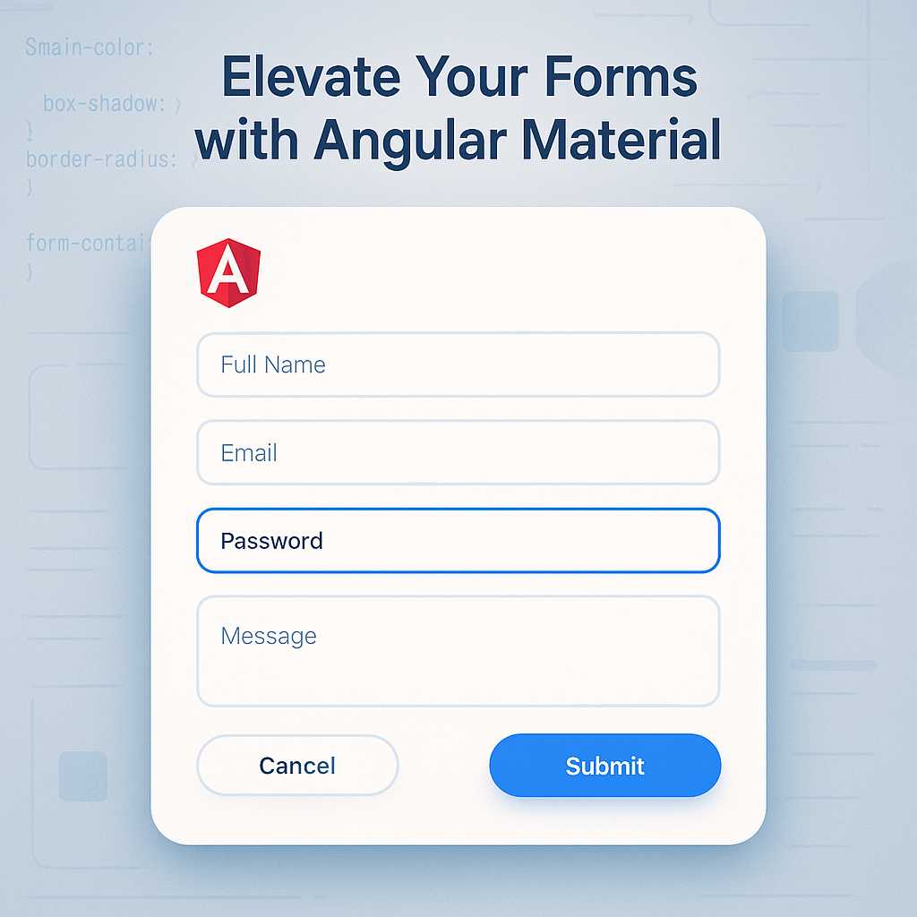
Elevating Forms in Angular with Material Design: A Guide to Stylish Inputs
When creating modern web applications, forms play a vital role in gathering user input. But a form is more than a collection of fields—it’s an opportunity to provide clarity, branding, and a seamless user experience. Angular Material makes it easy to craft beautiful, responsive, and accessible input forms. In this guide, I’ll walk you through…
-
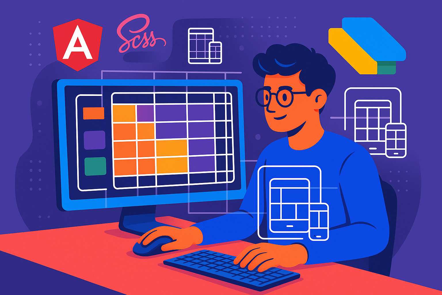
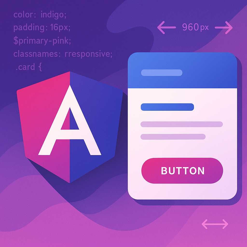
Crafting Responsive Layouts in Angular with SCSS Grid Techniques
Responsive design has become a cornerstone of modern web development, ensuring users get a seamless experience across all devices. As a web designer working with Angular, I’ve found SCSS grid techniques to be invaluable for creating flexible, adaptive layouts that play well with Material Design concepts. In this article, I’ll guide you through crafting responsive…
-
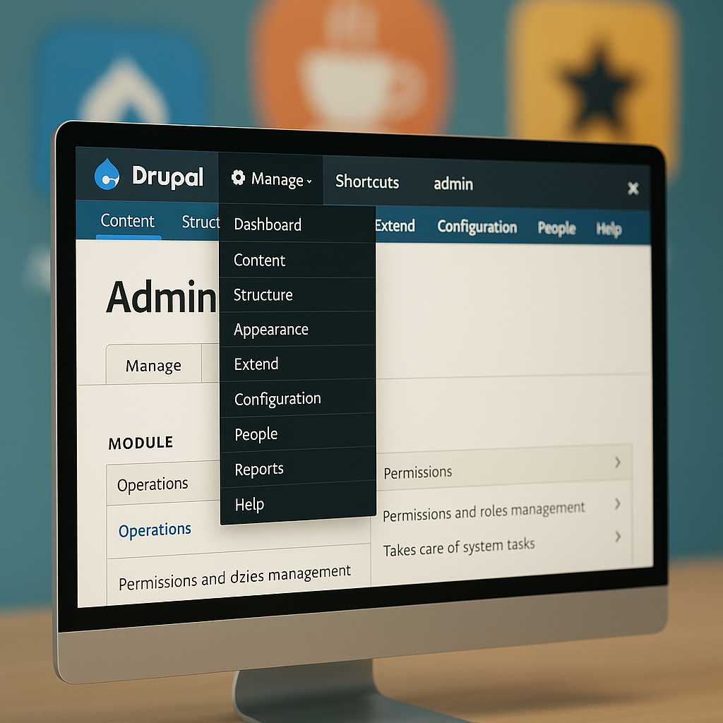
Customizing the Drupal Admin UI with Admin Toolbar and Beyond
As a Drupal developer, one of my favorite tricks to improve both my workflow and my clients’ satisfaction is refining the Drupal admin interface. While Drupal’s default admin backend is powerful, it can be overwhelming—or a bit inefficient—out of the box. Today, I’ll walk you through practical enhancements you can make to the admin UI,…
-
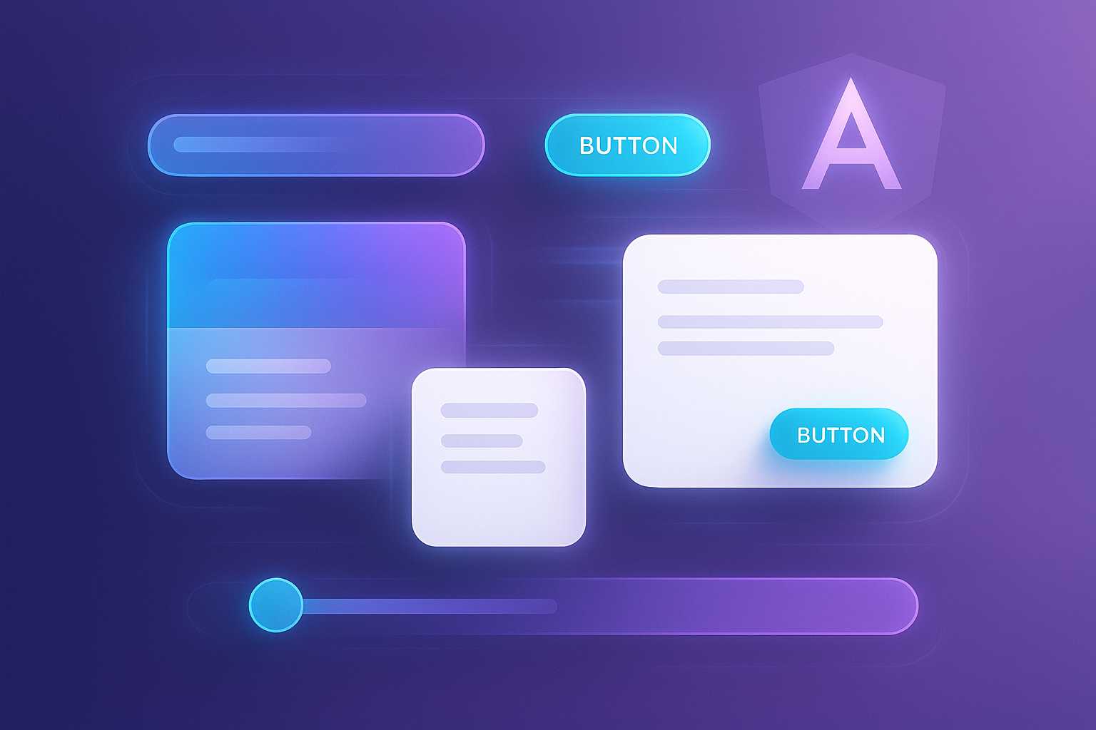
Getting Started with Material Design in Angular: Styling Your First Component
As a web designer, I’m always on the lookout for ways to create visually appealing and user-friendly interfaces. Material Design, developed by Google, provides a cohesive design language and a vast set of UI components, making it a popular choice for Angular developers. In this article, I’ll guide you through the basics of implementing Material…