
Tag: Angular
-
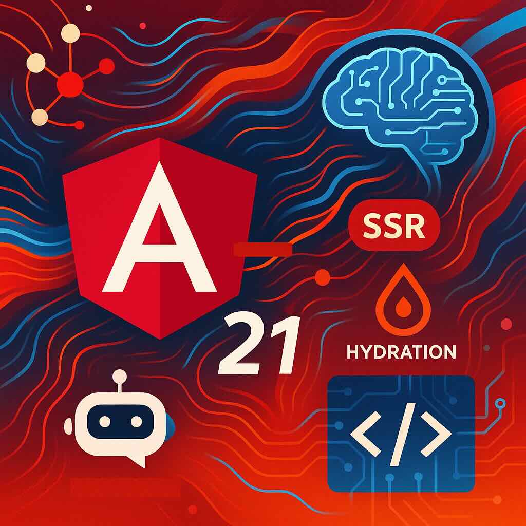
Angular 21: The Modern Transformation Every Developer Should Know About
If you’ve been waiting for a reason to give Angular another look, Angular 21 is the game-changing upgrade developers have been hoping for. With its official release in November 2025, Angular 21 is not just an incremental bump—it’s a fundamental transformation that brings the framework squarely into the modern era. Let’s break down the biggest…
-
Top 5 Common Pitfalls When Using Angular Signals—and How to Avoid Them
Angular Signals are a hot topic in the Angular ecosystem, promising more granular reactive change detection and increased performance. However, as with any new pattern, integrating Signals into real-world applications comes with its own set of challenges. In this article, we’ll walk through five of the most common mistakes developers encounter when working with Angular…
-
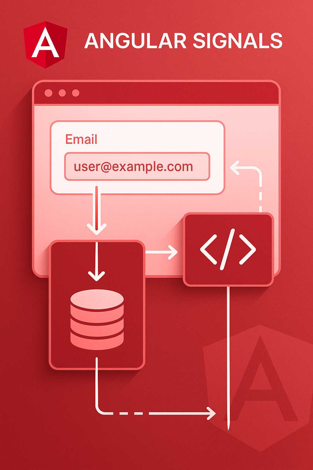
Angular Signals in Practice: Integrating Signals with Forms and Services
Angular Signals have recently emerged as a core piece of the Angular reactivity model, offering a more predictable and explicit mechanism for tracking and responding to change. While Signals are powerful on their own, developers often ask: how do you integrate them effectively with Angular’s forms and services, both of which are fundamental to most…
-
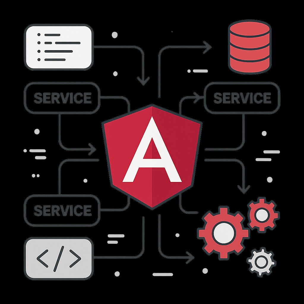
An Introduction to Angular Services: Structure, Injection, and Best Practices
Services are one of the fundamental building blocks of Angular applications. They allow you to encapsulate logic, share data and functionality across components, and keep your codebase modular and testable. In this article, I’ll discuss the essential concepts behind Angular services, cover the basics of dependency injection, and share best practices for designing your own…
-
Migrating an Angular Project to Standalone Components: A Step-by-Step Guide
With Angular’s recent releases, standalone components are becoming the default way to structure applications, offering simpler, more modular architectures without the need for NgModules. If you have a legacy Angular project, migrating to standalone components can modernize your codebase and improve maintainability. In this article, I’ll guide you through the process of migrating an existing…
-
Understanding Angular’s Zone-less (Zone.js Free) Future: What Developers Need to Know
Angular has long relied on Zone.js to drive its powerful change detection mechanism, making complex applications possible with relatively little manual wiring. However, with the introduction of Angular signals and recent improvements in reactive programming models, the Angular team has signaled an intentional move towards a zone-less (zone.js free) future. In this article, we’ll explore…
-
Exploring Angular Signals: A Deep Dive into Angular’s Reactive Change Detection Model
Angular has long been renowned for its powerful change detection mechanics, but recent developments have added a fresh new concept: Signals. If you’re familiar with state management in modern front-end frameworks, you might recognize the potential here for better reactivity and finer-grained performance tuning. In this article, we’ll explore what Angular Signals are, their role…
-
A Practical Introduction to Angular Dependency Injection
Introduction If you’re working with Angular, you’ve likely encountered the term dependency injection (DI) numerous times. But what exactly is DI, and why is it so central to Angular applications? In this article, I’ll demystify Angular’s dependency injection system, show you why it’s beneficial, and walk you through practical usage patterns with clear examples. What…
-
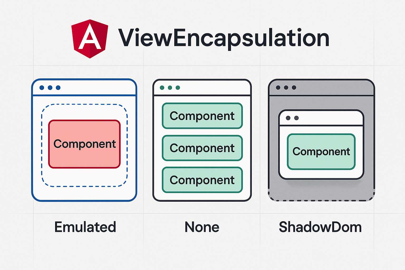
Demystifying ViewEncapsulation in Angular: A Practical Guide
When working with Angular, mastering how styles work can take your application from looking decent to looking polished and robust. A key concept in Angular’s styling system is ViewEncapsulation. Understanding how it functions and when to use each mode can help you avoid common pitfalls and make your styles more maintainable. What is ViewEncapsulation? In…
-
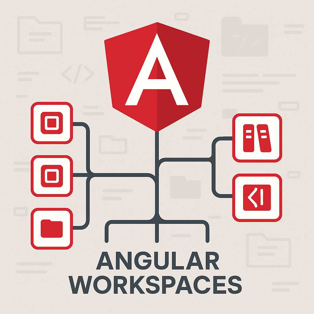
Harnessing the Power of Angular Workspaces: Effective Application and Library Management
Angular is a robust framework for building dynamic web applications, and as your projects grow, organizing your codebase becomes crucial. Angular workspaces are an essential tool that help developers efficiently manage multiple applications, libraries, and reusable components within a single repository. In this article, we’ll explore what Angular workspaces are, why you should use them,…