
Tag: SCSS
-
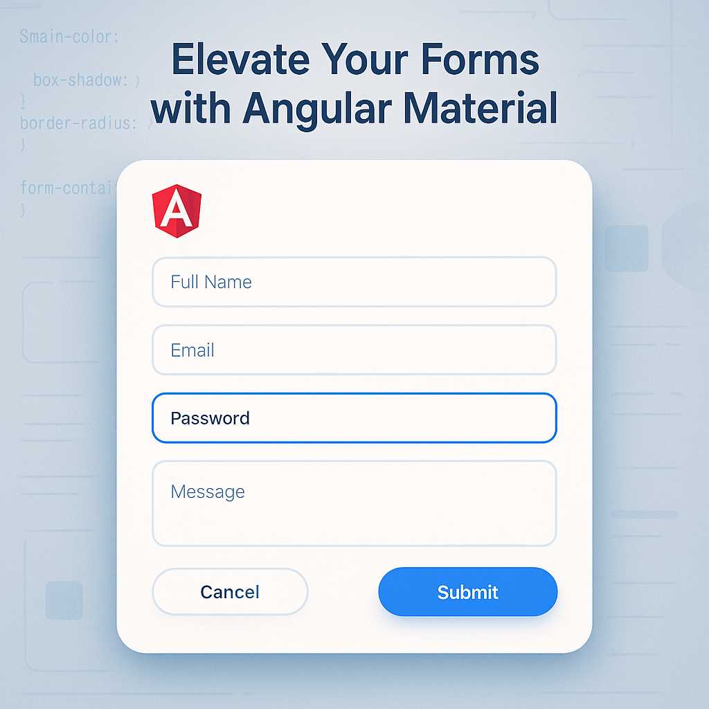
Elevating Forms in Angular with Material Design: A Guide to Stylish Inputs
When creating modern web applications, forms play a vital role in gathering user input. But a form is more than a collection of fields—it’s an opportunity to provide clarity, branding, and a seamless user experience. Angular Material makes it easy to craft beautiful, responsive, and accessible input forms. In this guide, I’ll walk you through…
-

Crafting Responsive Layouts in Angular with SCSS Grid Techniques
Responsive design has become a cornerstone of modern web development, ensuring users get a seamless experience across all devices. As a web designer working with Angular, I’ve found SCSS grid techniques to be invaluable for creating flexible, adaptive layouts that play well with Material Design concepts. In this article, I’ll guide you through crafting responsive…
-
Getting Started with Material Design in Angular: Styling Your First Component
As a web designer, I’m always on the lookout for ways to create visually appealing and user-friendly interfaces. Material Design, developed by Google, provides a cohesive design language and a vast set of UI components, making it a popular choice for Angular developers. In this article, I’ll guide you through the basics of implementing Material…